Trust is partly a page-structure problem.
A visitor cannot evaluate every claim the moment a page opens. They use signals. Clear language, familiar controls, readable content, and a sensible next step tell them that the business is organized and considerate.
When those signals are missing, the visitor has to work. They wonder whether they are in the right place, hunt for the service they need, pinch the screen, or compare several competing buttons. Every extra decision adds friction. Friction feels like risk.
Notice
The page earns attention.
Understand
The offer becomes clear.
Believe
Proof lowers uncertainty.
Act
The next step feels safe.
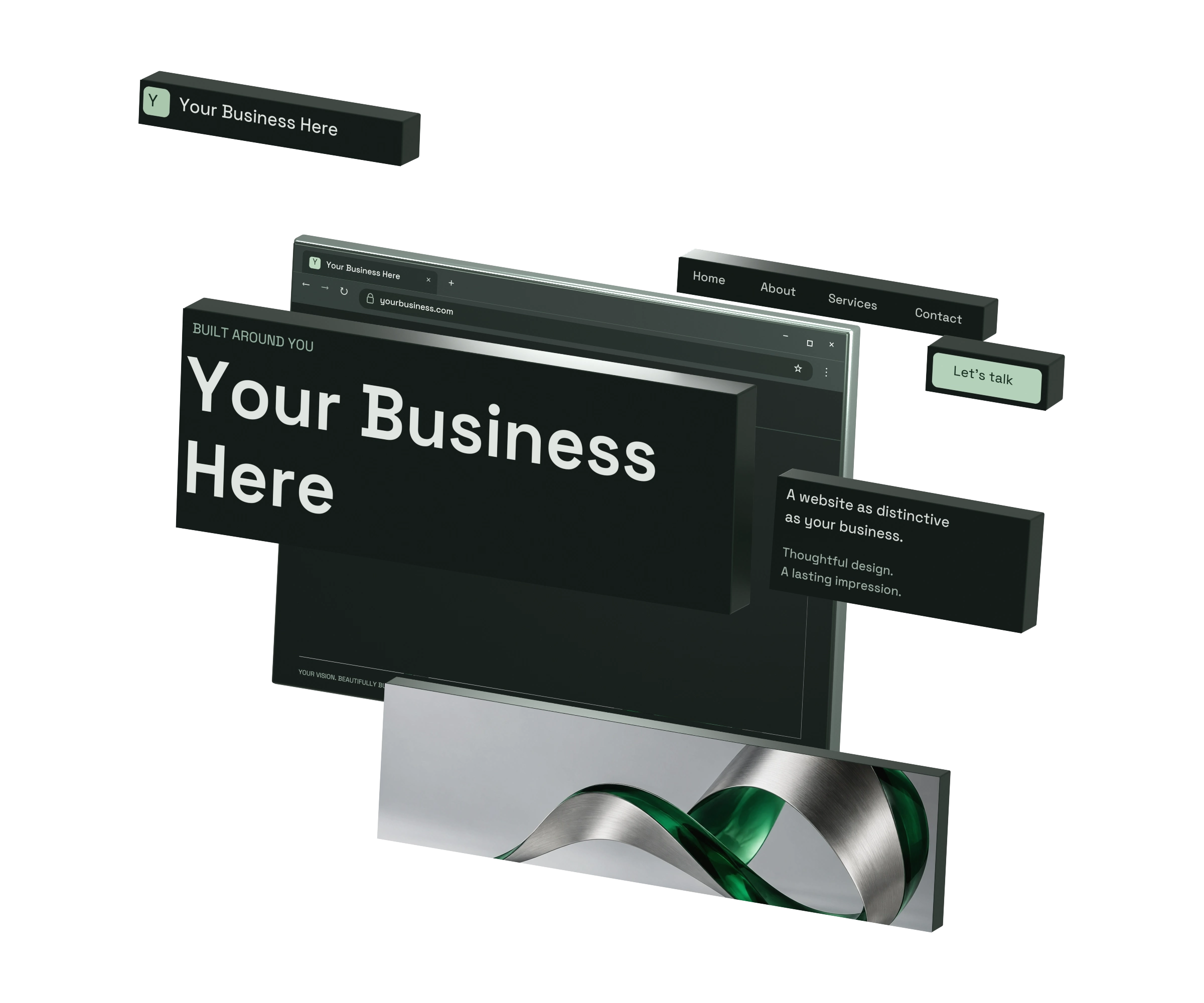
Tell people where they are before asking them to care.
Your first headline should describe the useful outcome of the page. Clever wording can support a clear message, but it should never replace one.
Better starts here.
We create bold experiences for tomorrow.
The visitor still has to discover what the company sells.
Mobile auto repair across the RGV.
A mechanic comes to your home, jobsite, or roadside location.
Service, location, and convenience are visible in one scan.
Write it step by step
- 1
Name the page's one job
Decide whether the page should introduce the business, explain one service, answer one search question, or support one campaign. A page with several equal jobs usually produces a vague headline.
- 2
Write down the customer's immediate need
Use the words a customer would use in a call or search. Start with the problem, outcome, service, or category they already recognize.
- 3
Add the useful difference
Explain what makes the offer fit: location, speed, audience, specialization, delivery model, or another concrete distinction.
- 4
Move details into the supporting sentence
The headline earns understanding. The next sentence can explain how it works, where you work, or why the offer is credible.
- 5
Run the five-second test
Show the top of the page to someone unfamiliar with the business. After five seconds, ask what the company does, who it is for, and where it operates.
Headline formula
Recognizable service + customer outcome + useful context
Example: Custom websites that help Rio Grande Valley businesses get found and chosen.
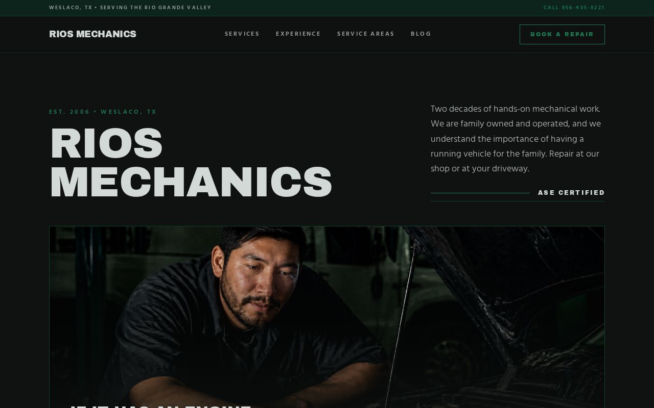
Design the reading order, not a smaller desktop.
Mobile design is a prioritization exercise. The narrow screen exposes what matters because every block has to appear in a deliberate order.
Readable
Body text starts around 16px with comfortable line spacing.
Tappable
Interactive targets are large enough for a thumb.
Stable
Media loads efficiently without jumping the layout.
Build the mobile version step by step
- 1
List the sections in decision order
Start with the offer, then the most relevant proof, essential details, and the next step. Put company history later unless it directly resolves a buying concern.
- 2
Use one primary column
A single reading path is easier to scan. Keep side-by-side content only when the items remain readable and their relationship matters.
- 3
Protect readable type
Use a comfortable body size, short paragraphs, clear subheads, and enough contrast. Avoid placing essential copy inside images.
- 4
Make targets thumb-sized
Buttons and links need comfortable height and breathing room. A practical target is at least 44 by 44 CSS pixels.
- 5
Reserve space for media
Set image dimensions or aspect ratios before the file loads. This prevents the call to action and surrounding copy from jumping.
- 6
Test a real phone and a slow connection
Check the first screen, menu, form fields, sticky elements, button reach, image loading, and the page after rotation.
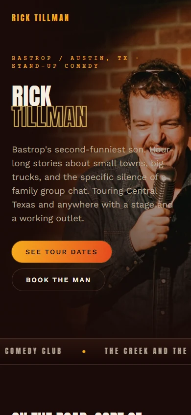
Mobile hierarchy
One screen, one next question.
- The brand and main action remain identifiable.
- The focal image supports the message instead of hiding it.
- The layout has a clear top-to-bottom reading order.
Give the page one primary decision.
A call to action works when it matches the visitor's readiness. It should describe a useful next step, look interactive, and appear after enough context to make the click feel reasonable.
Weak
Describes the interface, not the benefit.
Better
Clear, but still broad and high-friction.
Strong
Specific action with a useful outcome.
Choose and place the action step by step
- 1
Choose the primary conversion
Pick the one action that moves a qualified visitor forward: call, request a quote, schedule, buy, visit, or start an estimate.
- 2
Use action plus outcome
Write a button label that says what happens after the click. Request a quote, See website pricing, or Schedule a 15-minute call creates a clearer expectation.
- 3
Give it visual priority
Use one strong color treatment for the primary action. Secondary links can remain quieter so they do not compete.
- 4
Place it after decision points
Include the action near the opening, after key proof, and near the end. Repetition is useful when the wording and destination stay consistent.
- 5
Lower uncertainty nearby
Add one short reassurance if it is true, such as No obligation, Reply within one business day, or Month-to-month options available.
- 6
Track the outcome
Measure completed calls, forms, bookings, or purchases. A button click is a useful diagnostic, but the completed action is the business result.
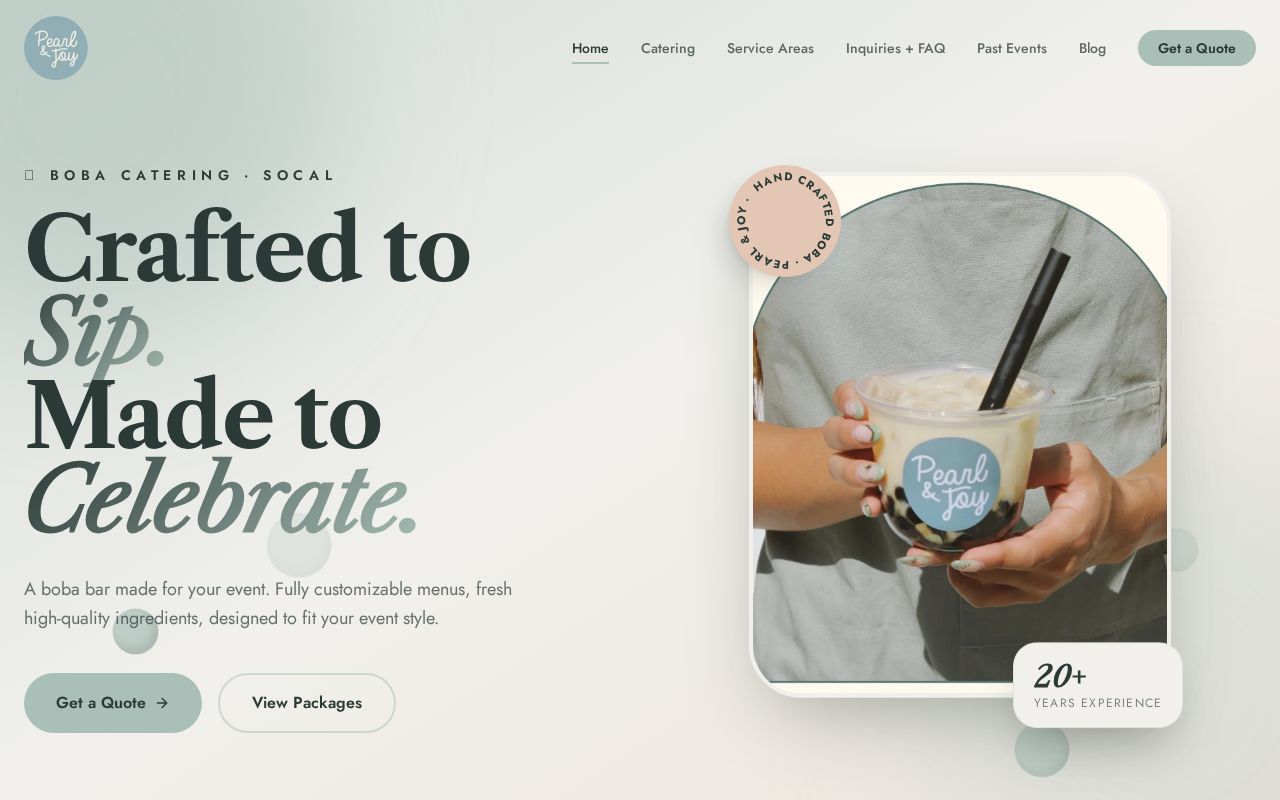
Assemble the page in the order people decide.
Do not start by decorating empty space. Start with the customer decision, build the content path, then use design to show what matters most.
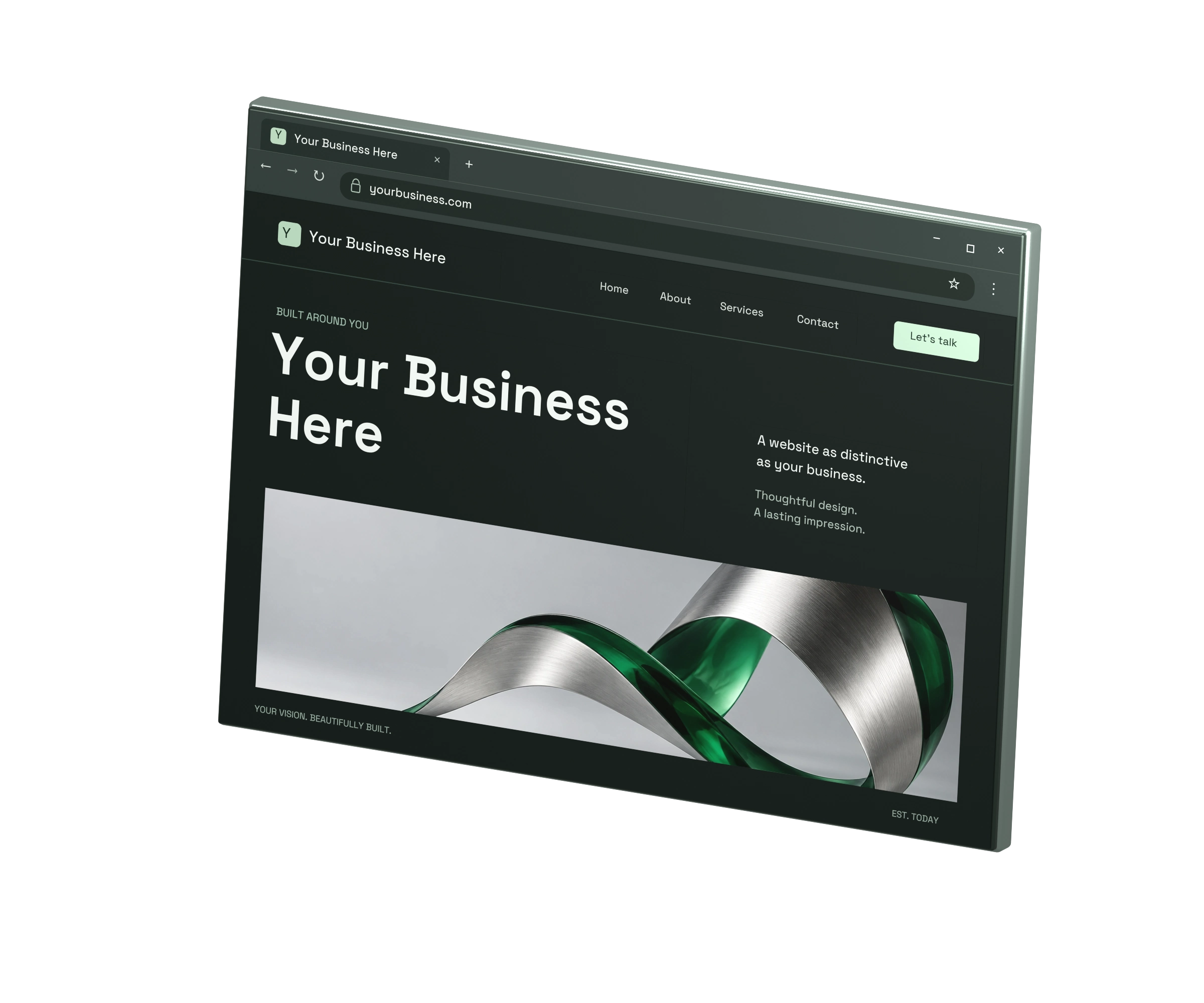
Start in grayscale
Confirm order, spacing, and priority before polishing color.
Use one focal point
Give each screen or section one dominant message or action.
Add style last
Use color, imagery, motion, and texture to support the path.
Review the page like a first-time visitor.
Open the page in a private browser window on your phone. Work through this list without using inside knowledge about the business.
Trust audit checklist
- I can say what the business does after five seconds.
- The headline describes an outcome, service, or clear category.
- The opening sentence adds useful context instead of repeating the headline.
- The mobile text is readable without zooming.
- No important content or control falls off the screen.
- The page does not jump while images and fonts load.
- The primary button looks like the obvious next step.
- Button wording tells me what happens next.
- Proof appears before the page asks for a major commitment.
- Phone, form, booking, or purchase flow works from start to finish.
Fix the first failed item before changing several things at once. If the headline is unclear, button color is not the main problem. If the mobile layout breaks, more testimonials will not repair the experience.
Watch what customers do next.
Give the new version enough traffic to observe a pattern. Compare business outcomes, not just visual preference.
Primary action rate
How often visitors start the intended next step.
Completed conversions
Calls, submitted forms, bookings, sales, or visits.
Mobile vs. desktop
Whether one device group struggles more than another.
Engaged page visits
Whether visitors stay long enough to use the page.
The page is doing its job when the right visitor understands the offer and can act without assistance.
That is the standard behind all three fixes: less interpretation, less friction, and a clearer path to a real business outcome.
Common questions
Website trust FAQ
How quickly do visitors judge a website?+
Visitors form an initial impression almost immediately, then keep or revise it as they scan the headline, page structure, proof, and next step. The practical goal is to remove confusion from that first scan.
Should every page use the same call to action?+
The site should have one primary conversion goal, but the wording can match the page. A service page may use Request a quote while a detailed guide may use See website pricing or Schedule a call.
What makes a page mobile-friendly?+
A mobile-friendly page has a logical reading order, readable text, generous tap targets, compressed media, limited layout shifting, and a primary action that is easy to reach without zooming or hunting.
Do these changes help SEO too?+
Yes. Clear headings help search engines understand the page, mobile usability supports visitors from search, and focused internal links make the site easier to crawl. These changes support SEO, but they do not replace technical SEO, useful content, or authority building.